Fearless is a sanitary pad brand dedicated to improving female hygiene and empowering women through education. The goal was to create a brand that is approachable, educational, and empowering, while breaking taboos surrounding menstrual health.
The Challenge
In many communities, female hygiene remains a sensitive and stigmatized topic. Fearless needed to:
Normalize conversations around menstruation
Build trust and credibility among young women
Deliver products that are both functional and visually approachable
Stand out in a market often dominated by sterile or clinical packaging
The Approach
Fearless was designed to feel empowering, vibrant, and approachable.
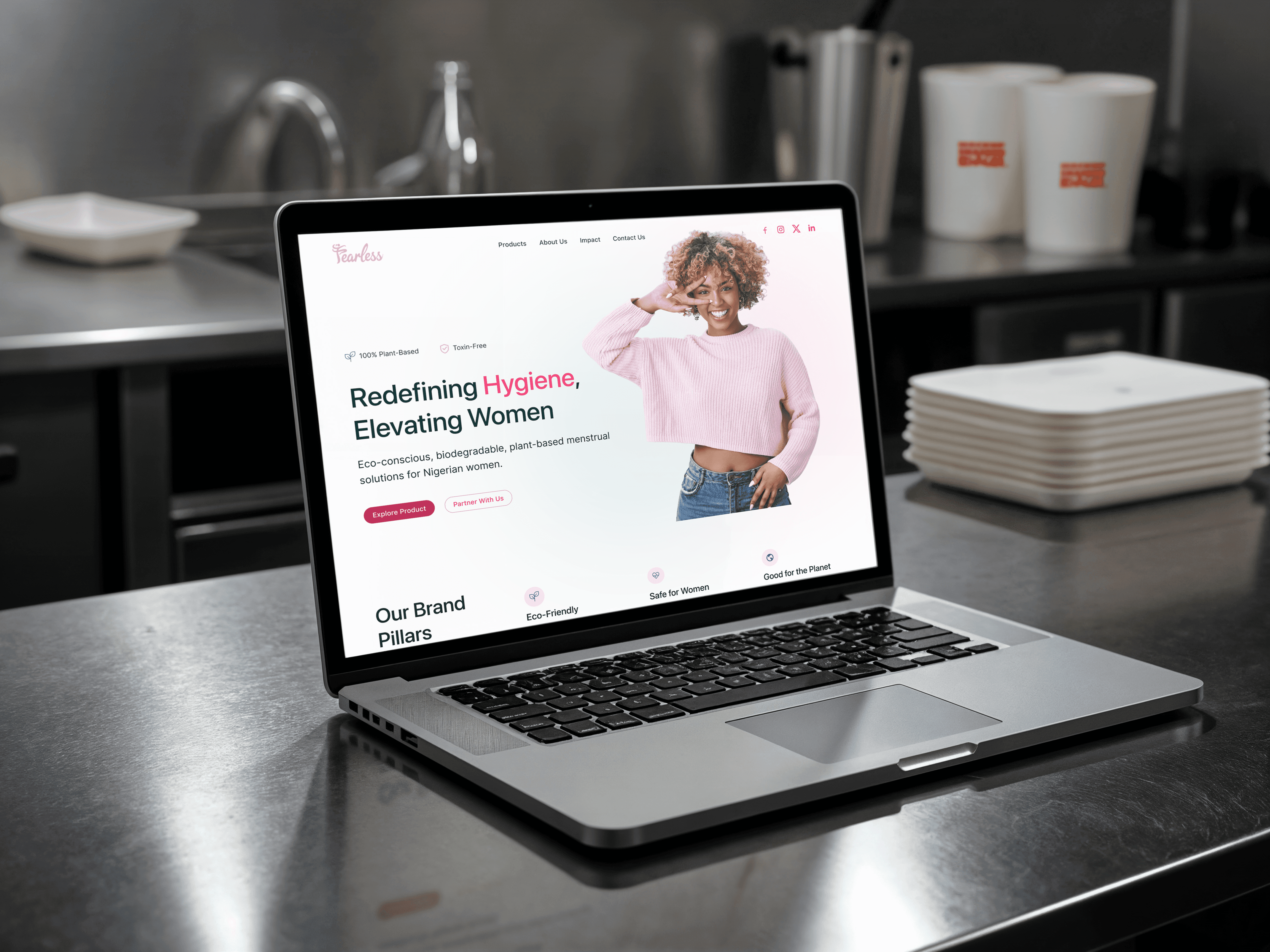
Logo & Typography
Soft, rounded typography conveys friendliness and care, while bold letterforms in “Fearless” communicate confidence and strength.
Color Palette
A lively mix of warm pinks and soothing teals creates a balance between energy and trust, resonating with young women.
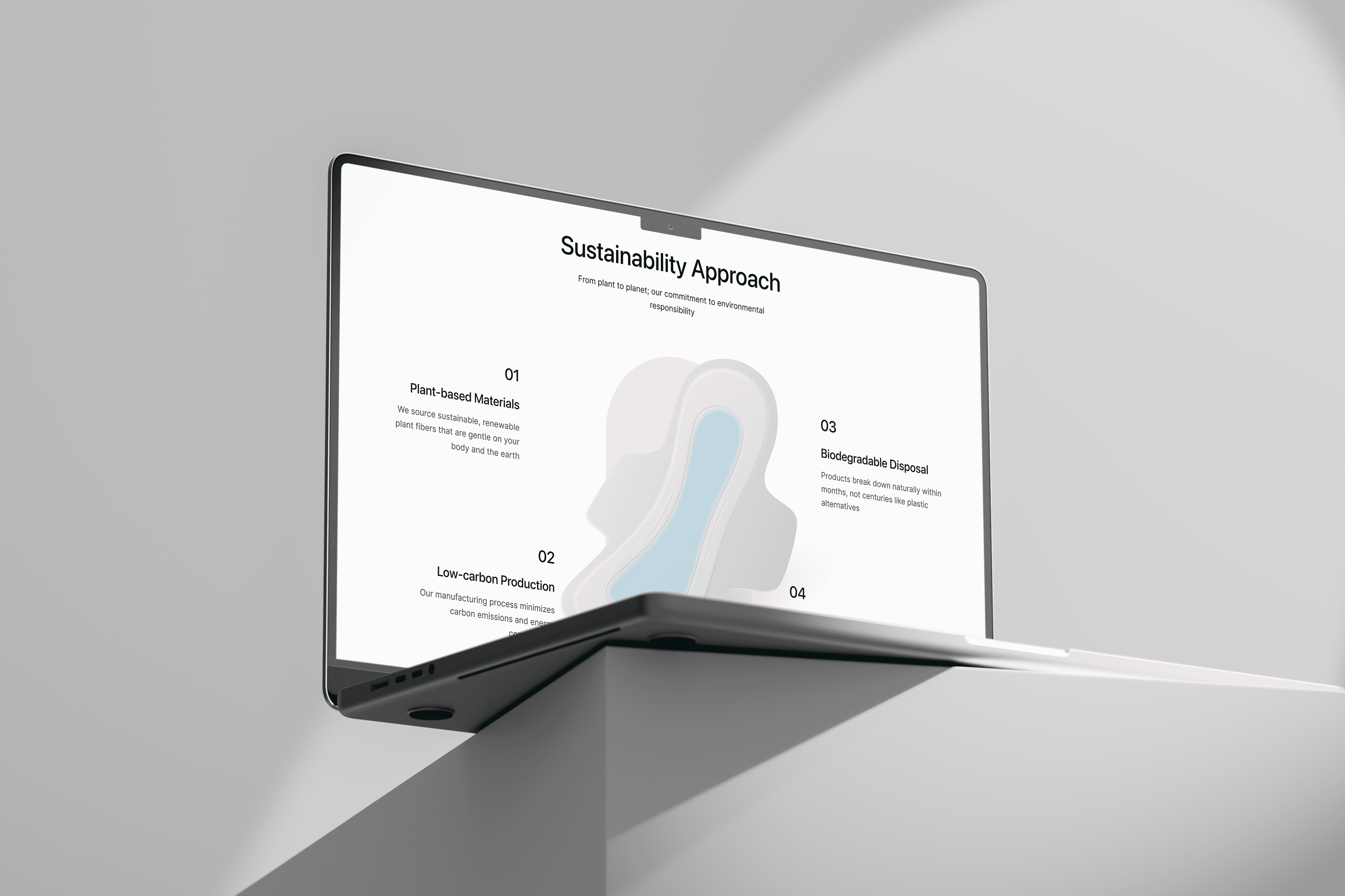
Visual & Illustration Style
Illustrations of confident, everyday women were incorporated to make the brand feel inclusive, relatable, and empowering. Educational messaging was integrated into the packaging and marketing materials to encourage open conversations.
Packaging Design
Minimalist yet engaging packaging highlights the product’s quality while using color coding and simple icons to communicate absorbency, comfort, and hygiene benefits.
The Outcome
Fearless successfully merges product functionality with social impact. The brand creates a safe space for conversation about menstrual health, builds trust with young women, and positions itself as more than just a sanitary pad — a movement for empowerment and education.